|
Some of you may have noticed a few differences recently in the look of The Conversation.
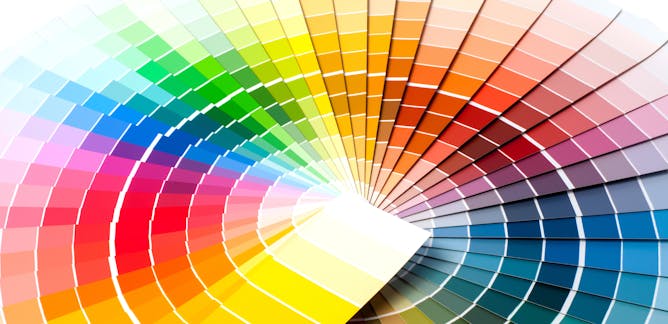
Our logo that appears at the top of the page has had a very subtle reworking – we’ve refined the speech bubble icon to optimize display across print and web applications. To improve accessibility, we’ll be updating our use of colours and typography. Examples of this transition can currently be seen in our heading font (we're now using Montserrat for headlines instead of Helvetica), links, footers and general graphic design – with more enhancements to follow.
As faithful readers, I wanted to share with you a few thoughts from Zoe Jazz, the Design Lead for The Conversation, who is managing this global initiative.
“We are grateful that our loyal readers deeply understand our brand, our mission and our values. There’s an opportunity to better demonstrate our point of difference to first-time readers. What we’ve done so far and what’s coming is more than just a ‘visual’ change. Our goal is to be more readable, inclusive, accessible, localized and sustainable so we can democratize knowledge to a wider audience. An accessible design system will allow us to live up to who we are and what we stand for. We hope our readers will appreciate these changes.”
In the spirit of great design, I’ve assembled a few of my favourite design-themed stories from The Conversation global network.
Have a great weekend. I'm heading out for some holidays, so you'll be hearing from other members of our editorial team next week.
|
Designing Weekend Reads
|

Ahmad Beltagui, Aston University; Achilleas Sesis, Kingston University; Nikolaos Stylos, University of Bristol
Why you shouldn't be afraid: it won't steal our jobs or destroy the environment.
| |
Sara Nabil, Newcastle University
Many homes are already smart – but they're about to get much smarter.
|
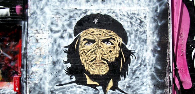
Maria-Carolina Cambre, Concordia University
Che Guevara's image has been used for everything from fashion shows to revolutionary posters. But his image still means something and represents change and resistance by everyday people. Why?
| |
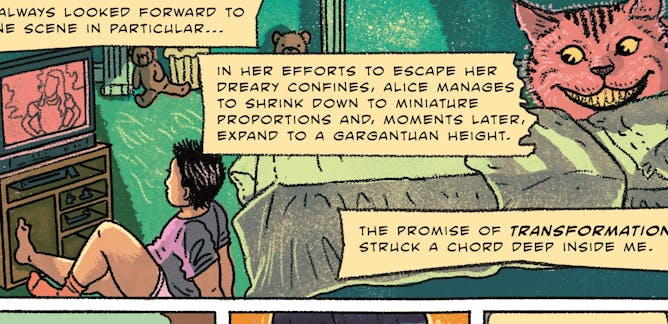
Phillip Joy, Dalhousie University; Matthew Numer, Dalhousie University; Megan Aston, Dalhousie University; Stephanie Gauvin, Queen's University, Ontario
Queer men's comics are contributing to changing cultural narratives about what queer men’s bodies should be, and health researchers are taking note.
|

Tom Lee, University of Technology Sydney; Alexandra Crosby, University of Technology Sydney; Clare Cooper, University of Technology Sydney; Jesse Adams Stein, University of Technology Sydney; Katherine Scardifield, University of Technology Sydney
With the benefit of hindsight, we might finally see that the iPhone was the opposite of minimalism.
| |
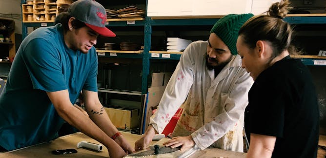
Ted Hunter, OCADU
Even as our world goes digital, there will always be an appetite for craftsmanship, for art and for the work only human hands can truly bring to life. Art and design schools should celebrate creators.
|

Geoff Cumming, La Trobe University
The earliest typewriters had the letter keys in alphabetical order. The trouble was that if you hit two keys quickly the levers would jam.
| |

Edward Henry Steinfeld, University at Buffalo, The State University of New York
Each device is complex in its own right, and trying to use them together in many different settings makes things even more complicated.
|
|
|