|
|
|
Editor's note
|
|
First, the confession. This idea came from Scott White, editor of the Canadian edition of The Conversation. So, if you receive the English language version of the Canadian newsletter it’s going to feel a little repetitive. However, it struck me as important. Because often news media make design changes and think readers won’t notice. But of course you do.
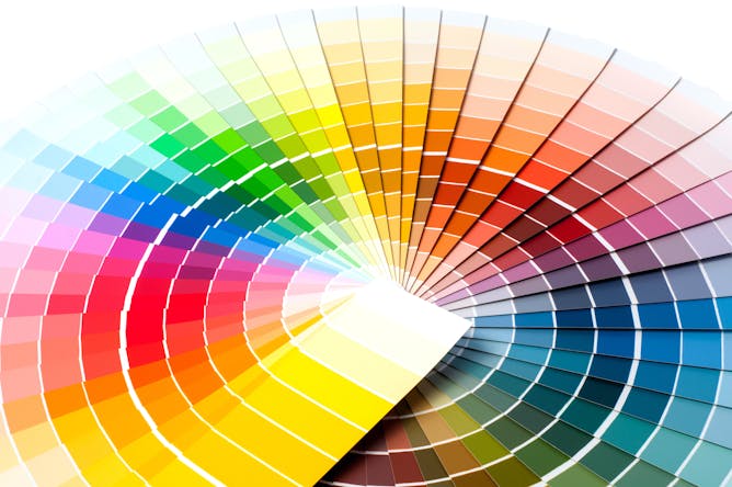
So here’s a little outline of what we’re doing and why. The logo that appears at the top of the page has had a very subtle reworking – we’ve refined the speech bubble icon to optimise how it appears online and when it is printed for promotion material. To improve accessibility and readability, we’ll be updating our use of colours and typography. Examples of this transition can currently be seen in our headline font (we’re now using Montserrat for headlines instead of Helvetica), links and footers. More enhancements will follow.
Here are a few thoughts on the changes from Zoe Jazz, the design lead for The Conversation, who is managing this initiative across the global network from the Melbourne bureau.
“What we’ve done so far and what’s coming is more than just a ‘visual’ change. Our goal is to be more readable, inclusive, accessible, localised and sustainable so we can democratise knowledge to a wider audience. A more accessible design will allow us to live up to who we are and what we stand for. We hope our readers will appreciate these changes.”
To mark this, Scott pulled together a few design-themed stories from The Conversation global network. You can read them below. And if you are reading this in England or Wales, I hope you are enjoying a relaxing bank holiday weekend.
We’ll be back with our usual news round up tomorrow morning.
|
|
|
|
|

Asharkyu/Shutterstock.com
Ahmad Beltagui, Aston University; Achilleas Sesis, Kingston University; Nikolaos Stylos, University of Bristol
Why you shouldn't be afraid: it won't steal our jobs or destroy the environment.
|
Bokeh Art Photo/Shutterstock.com
Sara Nabil, Newcastle University
Many homes are already smart – but they're about to get much smarter.
|
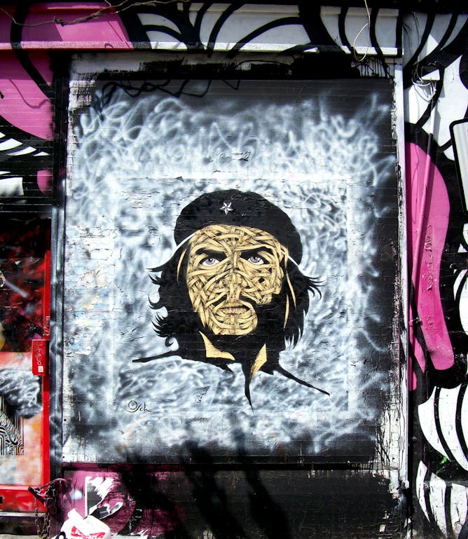
The ribbons on this grafitti portrait by London-based Chilean artist Otto Schade play with idea of presence and absence. The eyes evoke the intensity of the original.
Courtesy of the artist, Otto Schade
Maria-Carolina Cambre, Concordia University
Che Guevara's image has been used for everything from fashion shows to revolutionary posters. But his image still means something and represents change and resistance by everyday people. Why?
|
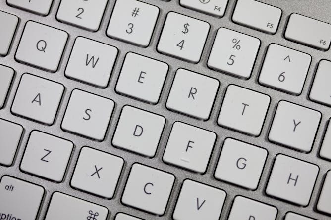
Many other key arrangements have been tried. Some are claimed to be easier to learn or faster to use than QWERTY. But none has proved good enough to beat QWERTY.
Flickr/Jeff Eaton
Geoff Cumming, La Trobe University
The earliest typewriters had the letter keys in alphabetical order. The trouble was that if you hit two keys quickly the levers would jam.
|
|
|
-
Tom Lee, University of Technology Sydney; Alexandra Crosby, University of Technology Sydney; Clare Cooper, University of Technology Sydney; Jesse Adams Stein, University of Technology Sydney; Katherine Scardifield, University of Technology Sydney
With the benefit of hindsight, we might finally see that the iPhone was the opposite of minimalism.
-
Ted Hunter, OCADU
Even as our world goes digital, there will always be an appetite for craftsmanship, for art and for the work only human hands can truly bring to life. Art and design schools should celebrate creators.
-
Phillip Joy, Dalhousie University; Matthew Numer, Dalhousie University; Megan Aston, Dalhousie University; Stephanie Gauvin, Queen's University, Ontario
Queer men's comics are contributing to changing cultural narratives about what queer men’s bodies should be, and health researchers are taking note.
-
Edward Henry Steinfeld, University at Buffalo, The State University of New York
Each device is complex in its own right, and trying to use them together in many different settings makes things even more complicated.
|
|
| |
Featured events
|

|
Institute of Mental Health, University of Nottingham Innovation Park, , Nottingham, Nottingham, NG7 2TU, United Kingdom of Great Britain and Northern Ireland — University of Nottingham
|

|
34 Broad Street, Oxford, Oxfordshire, OX1 3BD, United Kingdom of Great Britain and Northern Ireland — University of Oxford
|

|
Berrill Lecture Theatre The Open University Walton Hall, Milton Keynes, Buckinghamshire, MK7 6AA, United Kingdom of Great Britain and Northern Ireland — The Open University
|

|
Here East, Queen Elizabeth Park, London, London, City of, E15 2GW, United Kingdom of Great Britain and Northern Ireland — UCL
|
|
|
|
| |
| |
| |
| |
| |
|
|
|
|
|
|
|